Tuesday, 7 December 2010

Final costumes/ props

Here is the perfume bottle that I will be using in my advert, the pink DKNY apple perfume


here is my final dress for the female actress


Here is my final costume for the prince


Overall I am very pleased with the costume/props that I had managed to get together and make, I really like the female character's dress as it really fits in...

Ancillary text research: Sponsorhip sequence

A sponsorshop sequence is a short advertisement placed before and after a TV show the audience theat they sponsor what it is that they are about to watch.


Example of a real Sponsoship sequences...

The ITV British time soap opera Coronation Street, Harveys is currently the sponsor the TV show. Harvey's sponsorship began on the 30th of September 2007. Cadburys was the first sponsor of Cornation Street beginning in July 1996. The original sponsorship squence had a chocolate like version of the street with chocolate characters resembling some of the actual Coronation Street characters.


Monday, 6 December 2010

Shooting - 1st December

Shooting- 1st December, 4th December The first of december was my first shoot that I have done for this piece, the fourth of december was the second attempt.Overall I don't think that these shoots went very well due to the weather, as it has been snowing this week it was very difficult to work in such cold conditions especially for the actors as they were not dressed for the weather. On wednesday the first of december it got dark very quickly and was not able to get a lot of work done. Apart from the weather it was a good shoot and I am quite happy with what I got, however I want to re shoot what I tried to achieve last week. I am going to be doing another shoot: saturday

Locations


Here is one of the shots that I may use in the opening of the ad, the main actress will walk down the path into the distance.


Here is another location that I may use in the opening of the ad, again I would have the actress walk across the field into the distance.


Here is the main location where everything should take place

Costumes


Here are my final costumes that my two actors will be wearing in the adverts...


Sunday, 28 November 2010

Codes and Conventions Of Perfume advert posters


Perfume Advert Posters
Nina by Nina Ricci winter perfume
Analysis
In the foreground of the poster we see the perfume bottle being portrayed to be the main focus of the image. A slight use of depth of field has been used to help the product to stand out above everything that is going on in the image. This is perhaps a way of showing the audience the importance of the product.
In the mid ground there is a woman in the centre of the frame. The long shot shows that she is made to look like she is walking over to the perfume, looking at her facial expression and mainly her eyes we can see that she is focused on the perfume. The character in the poster helps show the audience the level of importance that this product has, and just by looking at the women's facial expression it shows just how desirable it is.

Monday, 22 November 2010

ILP: Ancillary text breif

Having this ILP day for media was an excellent opportunity to focus on the research and planning of my ancillary texts. Here is the breif that I was giving for advertisement.

An advertising package for a new product or service, to include two TV advertisements, together with:

a TV programme sponsorship sequence
a web pop-up


I was very pleased with the second Ancillary text ''creating an web pop up'', with the skills that I have learnt through my second A'level subject PVA I have had a lot of experience in animation. There for I hope I will be able to produce great work through these skills.

Research

To help me through my work I have been looking at these blogs created last year for their coursework, I have looked through both blogs and I have to say that I am very impressed with the level of work and the amount of effort they had put in last year. I have really been looking into their ancillary texts and this has really helped me to understand what I need to do.

http://andrewjohnsona2media.blogspot.com/2010/01/codes-and-conventions-of-short-film.html

http://emilyjeanprescott.blogspot.com/2010/02/album-covers.html

Wednesday, 17 November 2010

Costume idea: Princess


This princess costume really caught my eye becuase not only does she look like the character which I designed but the overall forest setting and the dress is very similar to what I would like the princess to look like. I really like the colour of the dress, and and the material on the arms
it has a real authentic look to it.


I also really like this dress, it has a real authentic medieval feel to it which is what I want to go for. However It is very glamerous and perhaps too formal for the look I am looking for. I want the princess in the sequence to look feminine but not also formal, perhaps by wearing a knee length dress.


Tuesday, 16 November 2010

Costume ideas: Prince


Here is the first prince costume that caught my eye, it looks very authentic and the kind of look that I want the prince in my seqence to look like. I want the prince to look very heroic but charming at the same time.


Here is the second costume that caught my eye, to me parts of the costume are what I would like but overall it doesnt look very authentic and the colour of the costume is not what I would personally go for. Also I would not include the crown to the costume because I want the prince to look more heroic and masculine.

Tuesday, 9 November 2010

Sound Research

Animatic review

After completing both of my animatics they were then watched and reviewed by both my media studies teacher and peers. Their first reactions was that they were impressed with the drawings and how it was presented, they also commented on the fairy tale theme and that they thought it really worked. The only few problems that they had with the animatics was that they were both far too similar, that I needed to think more carefully about the narrative because it would have an effect on what messages I would try to deliver about the perfume itself. They also mentioned that I needed to include sound, I explained that I was in the progress of looking into what I would do with sound. 

After the animatics were reviewed I immediately started to think about how I could improve these adverts ideas. 
  1. I may start re storyboard a new idea for the second animatic as it was too similar to the first sequence
  2. I will look into sound, research different perfume advertisement to get ideas
  3. I also need to think about the sponsorship sequence that I am going to create 
  4. whilst re story boarding the second sequence I need to think more carefully about narrative, also camera angles and movements.

Monday, 1 November 2010

Final perfume bottle design

I have decided to go with the apple shaped perfume bottle to be used in the sequences, this is because I feel that it really fits the theme well not only the fairy tale look but a natural perfume theme as I am creating a perfume that looks like an apple and has a very natural scent.

I also feel that the apple fits in with the forest surrounding a lot better than the other designs as the location is also all natural. The apple perfume bottle fits in well with the fairy tale theme, it is similar to the story 'Snow White' where the princess is tempted with the beautiful red apple.

I will be purchasing this particular perfume bottle:

It is the Nina by Nina Ricci perfume, in the red version
I will be purchasing it from this website:
http://www.cheapsmells.com/productPaging.php?
productSex=her&category=Fragrance&brand=Nina+Ricci&name=Nina&gclid=CMrCr-rUoqUCFZ392AodVWDwIw

I will be updating a post to when the product arrives where I will discuss what I think of it, also with this I will also be creating a poster to test what kind of look I want to go for

Sunday, 31 October 2010

Animatic


Here are my first animatic sequences, a rough idea of what the final advertisements should look like. I am very happy with the animatics and the ideas so far however there is still a lot of room for improvement such as including sound into these sequences.


Second story board


Monday, 11 October 2010

Perfume bottle design


My advertisement will need to include the actual product itself in the sequence this means that I need to look into the different perfume bottles that I can use in for my advert, I cannot just design and make my own bottle due the the amount of money it will cost to have made. Instead I will need to buy a ready made perfume bottle and decorate it to look like my own.

I have been thinking a lot about the perfume bottle itself and how I wo
uld like it to look, in several sketches and story boards I have incl
uded at least two drawn designs of the bottle. The theme of my advert is fairy tale so I would like the bottle to portray this.

Here are some bottles that I have looked into, these are the s
ort of designs of perfume bottles that I would like to use in my advert.


Thursday, 30 September 2010

Cast


The princess
The main protagonist through out the sequences is the princess playing the princess will be Vicky Winfield (15). There are many reasons why I chose Vicky to play the part as the princess one of them is because her appearence is almost identicle to what I wanted the princess to look like through my sketches and storyboards. I wanted the princess to have long blonde hair and who was all round very natrally pretty and I believe Vicky fits this look and would play the part perfectly.


The prince
The second character in the sequences is the prince who will be played by Lewis O'Hara (17). I believe that Lewis fits the part very well due to certain parts of his appearance, such as his height, skin complexion and his hair. A key feature that I wanted the prince to have was long hair as this advertisement will be set in a different era in the past. Also the sketches that I had drew up of the prince looked very similar to Lewis which is another reason why I chose lewis to play the part.

Wednesday, 29 September 2010

Final story board


Developed story board


Sketches: inital ideas

Here are some of the sketches that I drew up for the different ideas that would go into my storyboard


Initial ideas

I have come up with a few ideas for what will be seen in the advertisement. These ideas were strongly helped through all all of my research and planning that I have gone through to be able to come up with these ideas.

Looking at all the different types of perfum ads it has helped me to narrow down which type of perfume advert I enjoy the most, this would be perfume adverts with a fairy tale aspects such as the 'Nina by Nina Ricci perfume advert' which I have looked into. Through my audience research I learnt that the audience watching adverts partically enjoy the adverts which are entertaining and they find that entertaining adverts encourage them to buy the product. The kind of TV advertisment which I want to create will be carefully planned and created to be very entertaining to watch.

  1. A princess wandering through the woods alone, she comes across the perfume and sprays it on herself. A prince on a horse shows up and takes the princess by her hand and takes her away...
  2. A young woman running through a tall hedge maze trying to find her way out, she then comes across the perfume and sprays it on herself, suddenly she is free from the maze
  3. A young woman is wandering through the woods covered in an old cloak, she then comes across the perfume and sprays it on herself, she then takes off the old cloak revealing that she is a princess in a beautiful dress...

Monday, 27 September 2010

Final idea

Through my research and planning I have decided to follow the natural perfume design. I personally prefer this idea myself as I have come up with a lot of ideas for my advertisement for this product. I also believe that the advertisement will be a lot more interesting to watch in comparison to the Glamorous perfume design.

Research

nicolekidmanchanelno5.jpg

20090403-9m3o.html.jpg


Here are some images which I have selected that show what kind of advertisement for a Glamorous expensive looking perfume that I want to create. These images follow the same look that am looking into going creating for my final piece.


The way that both these models are dressed are the type of look I would want the model in my piece to look like, wearing a long dress, diamond jewellery, hair style looking professionally done and well kept, strong makeup suitable for evening wear.


Also the locations in both these posters are the type of locations that I would like to shoot my advert in, I want this perfume to be suitable for that glamorous night out so I would want a night life surrounding e.g a bar or party.


Research

Nina-Ricci.jpgarden-pretty-poster.jpg


nina+ricci+ss+09.jpg cavalli+ss+09.jpg


Here are a few selected images from different perfume adverts, these images show what kind of look I would like my natural perfume design to look like and what the advertisement might look like.


a while back I researched into different perfume adverts that inspired me and that I really liked, one of these was the Nina by Nina Ricci perfume advertisement (The video is also included). I personally enjoyed this advert, I thought it was entertaining, creative. Because of this I would really like to create a piece following similar ideas from this advert.


The model's costume and appearance in the Nina Ricci perfume above is what I would want the model in my adverts

Initial ideas

After the useful questionnaire reasearch I decided to create a brainstorm to help come up with new ideas to develop my ideas for my perfume advert.


Looking now I think the themes that really initally interest me are Fairy tale, Galmorous and Natural - I will develop these three ideas by sketching and designg.


To help me further I am going to research into real and very successful perfumes that use some of these themes.

Audience research overlook...

My first questionnaire was to simply narrow down what types of advertisments people enjoyed/most interested in. The product that was most intereted in advertising that the most people selected was perfume- only women selected this answer which tells me that men would not nessasarilly would not be the right target audience when it comes to selling perfume. All women that answered the questionnaire were white british, all students and between the ages of '15 - 19'.

In my second questionnaire I became very interested in the females keen interest in perfume - hense why I decided to create a questionnaire asking questions on perfume. I searched for different women to answer this questionnaire this time to see if they too were just as interested in perfume as the last lot. I asked "how often do you buy perfume?" - 'every 5 months' was the most popular vote which shows that most women buy perfume quite often. Then I asked "what type of perfume do you look for?" the most popular vote was 'nice scent' - this tells me that advertising the perfume for its attractive scent would be very important. then I asked " what type of scent of perfume do you buy?" the most popular vote was 'sweet'.

Overall the questionnaires were very helpful into helping me find out what the audience want to see and dont want to see.

SELECTED PRODUCT

from this I have learnt that not only am I going to advertise a perfume advert but the standards that my perfume will need to have which is to have a "nice, sweet scent"

TARGET AUDIENCE

I have also learn more about the type of target audience that I need to reach out to with my perfume adverts which is...

-Females
-between the ages of '15 to 30'
-students

Monday, 20 September 2010

Audience research

From the previous Questionnaire it became clear to me that more 'perfume' is the advert that most people are interested in, from this I wanted to do another questionnaire on perfume for females only to gather more useful research.

Female only 10 new females answered the questionnaire

(Q1) How old are you?

8 selected '15 - 19', 2 selected '20-30'

(Q2) occupation?

8 selected student, two selected 'other' and stated "hairdresser"

(Q3) have you ever OR do you wear pefume?

All 10 selected 'wear perfume'

(Q4) how often do you purchase perfume?

2 selected 'monthly', 4 selected 'once every 5 months' and the rest selected 'once a year'

(Q5) what type of perfume do you look for?

5 selected 'nice scent', two selected ' bottle design' and 3 seleted ' the designer lable'


(Q6) what type of scent of perfume do you buy

8 selected 'sweet', two selected 'natural scent'

Audience research

This Questionnaire was a Qualitative Survey Questionnaire asking questions to narrow down what type of advertisements they are most interested in and what makes a good advertisement.


Female only 8 females answered this questionnaire


Q1) How old are you? -


Four out of eight females that were between the ages of fifteen and nineteen, one female was between the ages of ten and fifteen.


Q2) Occupation? -


All females were students


Q3) Ethnicity ? -


All women were White British


Q4) How often do you watch TV? -


Four women selected 'sometimes', four women selected ' everyday'


Q5) Do you enjoy advertisements? -


four women selected 'no', one selected depends, three selected 'sometimes'

Q6) What types of advertisements are you most interested in?


6 women selected 'perfume', two selected 'new technology'


--


Male only 8 males answered this questionnaire


(Q1) How old are you?-


6 out of 8 males were the ages between 'fifteen and ninteen' 2 were between the ages of '20 and 30'


(Q2) Occupation? -


All males were students


(Q3) Ethnicity?-


5 out of 8 males were 'white british', 2 selected 'asain'


(Q4) How often do you watch TV?-


7 out of 8 males said 'everyday', one selected 'sometimes'


(Q5) Do you enjoy Advertisements?-


4 males selected 'depends', one selected 'yes' and three said 'no'


(Q5) What types of Advertisements are you most interested in?-


2 men selected 'new technology', 1 selected 'cars', the rest selected 'none'

Perfume research: what I have learnt

From the research I had carried out into perfume it was very useful in showing me the many different ways which perfume is presented and that the way it is presented has an effect on the perfume itself. Due to presentation it not only shows the audience what kind of perfume it is but what kind of people it is suited for.

Also researching into the different types of perfume has helped me to understand that I also need to decide what particular type of perfume my own will be in order for this perfume to be successful.

Wednesday, 15 September 2010

Perfume research

This perfume could be seen as a natural and soft looking perfume, suited for a much wider varitey of women. The use of colours such as blues and greens gives a real natural look to this perfume. However these two colours are also very soft shades of blue and green giving this perfume a real soft look also. The use of birds in the image reinforces the idea of this perfume advert going with a very natural look. Also the way that Britney Spears is dressed in this image could perhaps show what type of audience is targeted at, she is wearing very simple clothes which also show off a lot of skin. This could perhaps portray the idea of natural beauty. This therefor supports the idea of this being a very natural perfume.
Tuesday, 14 September 2010

Perfume research

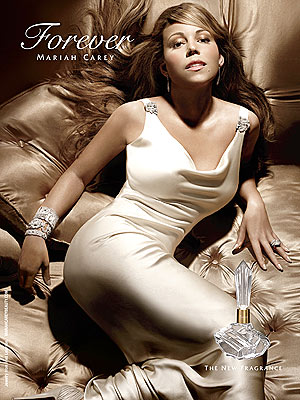
This particular perfume would be seen as a very glamorous and a very expensive looking perfume.
The use of colours, such as rich beiges and golds gives the perfume a very glamorous/ expensive look to it. reinforcing this the model in the image ( Mariah Carey) is dressed very formally in what looks to be very expensive clothing, her long cream coloured dress, Diamond jewlery. This could perhaps be showing the audience what kind of women this perfume is targeting. This particular perfume could perhaps be targeted for upper class women.

Perfume research

This perfume would be seen as a punk/rock woman's perfume, due to the look that was chosen for the perfume. The use checkered patterns and black studded stars create a real rock look to the perfumes design, the dark purples and black colours reinforce this.

The way that Avril Lavigne is dressed in this advertisment also reinforces the idea of this being a punk/ rock perfume. Her dark makeup and studded belts and black gloves helps to show what social label she is trying in interpret. Her clothing also shows the audience exactly what type of people this perfume is targeted at. 

Monday, 13 September 2010

Perfume research


Through my research into different p
erfumes and how they are advertised it has shown me that there are many designs, styles and perhaps social labels with in the product itself.  

This particular image to the left for example would be known as a 'girly' 
looking perfume. Due to the use of the stereotypical feminine colour pink.
Also the perfume bottle and box has a flower print on it which reinforces the idea of this perfume 
looking very girly and feminine.

Thursday, 15 July 2010

Thought process

After researching into adverts that really appeal to me I would really like to create an advertisement which is very creative and is very entertaining to watch. So far I have not decided exactly what I will be advertising but I do know what I would like the advertisement to be like.

I have been influenced by two adverts that are in my previous blog 'Influences'

Friday, 9 July 2010

Influences

Here are some advertisements that I really think are very interesting and may perhaps inspire my own final piece. What I really like about these advertisements is that they take a different approach to typical adverts, instead of giving us detail about the product they just make the adverts very beautiful, creative and intereting to watch.


Wednesday, 7 July 2010

Initial brainstorm

Here is my first initial ideas brain storm, I have explored a wide variety of different products and services that I could create and advertise for my course work. This has really helped me to come up with a lot of interesting ideas that I could use, my next step will be to select different ideas from this brainstorm that interest me most and develop and research into them further.

Here I have used the mind mapping method, this method has really helped me to come up with a lot of ideas due to the use of branches that branch out to new ideas.


Thursday, 1 July 2010

Advertisement analysis


Mise-en-scene: The advertisement begins with a mid shot of a woman's hand holding a glistering crystal ball, as the camera zooms in the location becomes clear to what looks to be a castle, this creates a dream like sense to the sequence making it look very interesting to watch as it is different from the reality that we live in. the camera cuts to a birds eye view shot of a woman opening two white doors then a long shot of the women looking into the room, the surroundings are very feminine due to the pink and white walls and doors. The feminine surroundings contrast with the female character as she is wearing a long pink princess like dress. This scene makes it very clear to what audience this product is trying to target due to the typical female surroundings and a stereotypical looking female. 

Sound: The advertisement begins with a mid shot of a glistering crystal ball, shimmering like diagetic sounds from the crystal ball are heard to create a realistic sense to this fairy tale like scene. Further on into the sequence non diagetic classical opera music is played through the rest of the sequence, this not only links back to creating a dream like sense to interest the audience but it also links back to the female target audience, this music itself is very feminine which supports what is going on in the sequence. 

Camera: The advert begins with a mid shot of a glistering crystal ball, 

Editing: 
 

Monday, 28 June 2010

Chosen brain storming method

Overall I have decided to use the 'mindmapping' method. The reasons why I have chosen this technique is because it will allow me to not only come up with new ideas but also develop them further due to the branches that are used.

Also I have used this method many times before in my pass studies and wish to use it again as it has helped me very successfully before.

Mind mapping

What is mind mapping?

A mind map is a diagram used to represent words, ideas, tasks, or other items linked to and arranged around a central key word or idea. Mind maps are used to generate, visualize, structure, and classify ideas, and as an aid in study, organization, problem solving, decision making, and writing.

The elements of a given mind map are arranged intuitively according to the importance of the concepts, and are classified into groupings, branches, or areas, with the goal of representing semantic or other connections between portions of information. Mind maps may also aid recall of existing memories.
How to create a mind map:

Start in the middle of a blank page (landscape or portait), write/draw an idea.

Put down ideas arount the first idea, develop and ideas that relate to it

Repeat the same process for the subtopics, and carry on until your page is full of useful ideas that will lead you into your final idea.


Final thoughts: I also like this idea very much, and I think with this method I will be able to develop my initial thoughts rather than just coming up with ideas.

Information from: http://www.lifehack.org/articles/productivity/rico-clusters-an-alternative-to-mind-mapping.html
http://en.wikipedia.org/wiki/Mind_map

Rico cluster

What is a rico cluster?
Rico clustering is a brainstorming tool that emphasizes the connection between left-brain openness and connection-making and right-brain verbalization and ordering.

Rico clustering is a brainstorming tool that emphasizes the connection between left-brain openness and connection-making and right-brain verbalization and ordering. Although it is intended primarily as a writing tool, it can also be applied to teaching — and Rico herself has written about its use as a therapeutic tool, as well.Here’s the basic idea:

  • Write a word in the middle of a sheet of paper.
    Circle it.
    Write down the first word or phrase that comes to mind and circle it.
    Draw a line connecting the second circle to the first.
    Repeat. As you write and circle new words and phrases, draw lines back to the last word, the central word, or other words that seem connected. Don’t worry about how they’re connected — the goal is to let your right-brain do its thing, which is to see patterns; later, the left-brain will take over and put the nature of those relationships into words.
    When you’ve filled the page, or just feel like you’ve done enough (a sign of what Rico calls a “felt-shift”), go back through what you’ve written down. Cross out words and phrases that seem irrelevant, and begin to impose some order by numbering individual bubbles or clusters. Here is where your right-brain is working in tandem with your left-brain, producing what is essentially an outline. At this point, you can either transfer your numbered clusters to a proper outline or simply begin writing in the order you’ve numbered the clusters.
    By the time you’ve started reviewing your clusters, your brain has done much of the work of fleshing out your ideas; all that remains is to put these relationships into words, which is what your left-brain excels at.
    The Rico cluster grabbed my attention because I’ve lately been thinking a lot about how to brainstorm alone and this seems to fit the bill. I suppose “regular” mind mapping would do the trick, but I was pretty put off by the extravagant claims made by mind-mapping advocate Tony Buzan; clustering seems much more down-to-earth and homey than Buzan’s elaborate, multi-colored, goal-oriented mind maps. Maybe that’s just me, and I’ve bought into mind mapping under a different name; so be it.


    My own thoughts: I think this is a very creative way of coming up with new ideas and I may consider using this brainstorm method to help me come up with my own ideas for my course work.

    Information from:
    http://www.lifehack.org/articles/productivity/rico-clusters-an-alternative-to-mind-mapping.html

Wednesday, 23 June 2010

Advertising analysis


Mise-en-scene: The advertisement opens with a close up shot of a mans hands picking up the ipad, then immediately cuts to a centralising frontal close up view of the ipad. The composition of the product being in the centre shows the audience its level of importance, this perhaps is a way of persuading the audience to purchase the product as it is portrayed as an important device to own. Moving on, Through out the sequence lots of various apps and other useful pages are brought onto the screen, for example books to read, family photos, websites, maps. By showing a variety of different things that you can do with the product this helps the advertisement reach out to a wider audience with different needs.

Camera: The advertisement opens with a close up shot of a mans hands picking up the ipad, then immediately cuts to a centralizing frontal close up view of the ipad. The composition of the product on screen shows the audience the products level of importance, which could perhaps persuade the audience to purchase the product as it is shown as an important product to own.

Editing: The Advertisement opens with very slow paced editing, soon after the male character picks up the device the editing then begins to speed up and become a lot more interesting and exciting for the audience to watch and uses many cuts and jump cuts . This could perhaps be a way of showing the audience just how fun this device is there for engaging them and persuading them to purchase the product.

Sound: Although there is no diagetic sound heard in this advertisement non-diagetic music is played through out the advert. The song played "There Goes My Love" by The Blue Van' is a very upbeat rock song which really brings the sequence to life, it creates a sense of fun to the sequence which perhaps is a way of telling the audience that this is a very fun and interesting product. The use of no diagetic sound is effective, it keeps the advert very simple and fun to follow. This shows the audience perhaps that this product too has no real complications and is a simple fun device to own.


Advertising analysis


Mise-en-scene: The advertisement opens with a centralised mid shot of a women sitting at a dressing table followed by a close up shot of the woman's reflection in the mirror, she then begins to get ready and sprays herself with the perfume which is the product being advertised. This could show that this is targeted towards a female audience as this could relate to what a typical women does perhaps daily by trying to make them selves look nice for what ever the occasion. A variety of shots of paparazzi taking flash photography is included in the sequence, this shows that this woman is an important person which promotes the perfume's status because it is being used by a celebrity. This could perhaps persuade the audience to want to buy this product because celebrities are seen as icons and a lot of people want to live up to what most celebrities have, including this product used by a celebrity.

Editing: The editing begins slow paced with only a a few jump cuts showing the paparazzi. Editing pace speeds up with a variety of cuts and jump cuts when the woman is getting ready, this creates a lot of excitement for the audience and a very interesting sequence to watch. This again engages the audience as this product includes a very interesting advertisement which they will remember.

Sound: Non diagetic classical jazz music is played through out the advertisement which plays a very important part, it brings the sequence to life and creates a lot of excitement through out the extract which is very engaging for the audience to watch. Diagetic sounds of the crowd of people cheering are heard, again reinforcing the idea of this female protagonist being a very important person. Through out the sequence off screen diagetic voices are included, which are mainly compliments from men being given to the women such as "she's the one" and "I think you look gorgeous" are included. This is a way of telling the audience that if you were to wear this perfume you could be admired and complimented.

Camera: The advertisement opens with a centralized long shot of a female starring into the mirror. Variates of mid shot shots of paparazzi are included which perhaps show her level of importance and her high class status. A close up shot is then shown of the woman playing with her hair in the mirror, this centralizing shot also shows her level of importance to the sequence.


What is advertising?


Advertising is a form of communication to persuade viewers, readers and listeners to purchase products, gain ideas or be introduced to a service. Advertsiments include the product name or name of service, a priority that an advertisment must have is to engage with its audience, this is one of many ways to successfully persaude an audience to purchase the product. Advertisements are seen almost everywhere, modern advertising has developed dramaticly over the years which a success as it is a lot easier to reach out to a larger audience. Advertising is shown through television, radio, news, internet, magazine, bill boards, published pictures and articles.


Monday, 21 June 2010

Chosen Breif

Through my research into each brief I have decided to go with brief 3 - creating an advertising package for a new product or service.

I decided to go chose this brief because I personally think it looks the most interesting and a fun piece to put together. I want to create a product that I personally would be interesting in buying if it were a real product, such as perfume or a electronic device. This is because I am interesting in these sorts of adverts when they are on TV, I also want to work with a product that I would enjoy.

A2 media studies portfolio in media

During this course I will have to produce the following:

A media portfolio, comprising a main and ancillary texts

A presentation of your research, planning and evaluation in electronic format

Breif one: Music video


A promotion package for the release of an album, to include a music promo video, no longer than five minutes duration, together with:

A cover for its release as part of a digipack (CD/DVD package)
A magazine advertisement for the digipack

Research: to help me look into ideas for this breif I will...

Look at past A2 students finished music videos
Look at real music videos from several music genres
Look at different CD covers and Magazine advertisements

Breif 2

A promotion package for a new film, to include a teaser trailer, together with:
  • a film magazine front cover, featuring the film
  • a poster for the film
Research: to help me look into ideas for this breif I will...

Look at several finished A2 trailers
Look at real film trailers
Look at film posters

Breif 3

an advertising package for a new product or service, to include two TV advertisements, together with
  • a TV programme sponsorship sequence
  • a radio advertisement
Research: to help me look into ideas for this breif I will...

Watch several finished A2 TV adverts
Watch several real TV adverts
Listen to A2 radio adverts
Listen to real radio adverts

Breif 4


A short film in its entirety, lasting approximately five minutes, which may be live action or animation or a combination of both, together with:
  • a poster for the film
  • a film magazine review page featuring the film
Research: to help me look into ideas for this breif I will...

Watch several finished A2 short films
Read several A2 reviews/ real film reviews
Look again at several film posters of different genres